How to Increase Conversions with Effective Product Page Design

Editor's note: In the article, Tanya explains why good product page design is important in ecommerce and how to optimize product pages for search engines and conversions. If you decide to improve the elements of your product pages, read on and explore our ecommerce design services.
As an ecommerce company, you don’t want a situation where a shopper is impressed by the ad and proceeds to the product page only to find it disappointing – without an illustrative description, quality images, or any customer feedback about the product. And just like that, a landing page not optimized for conversions can affect the success of the whole marketing campaign.
Based on ScienceSoft’s experience, I’ll share how to avoid such unfortunate situations with product page optimization. The scope of product page optimization activities may include customer journey analysis, usability and A/B testing, segmentation and content personalization, customer feedback collection, and more. It’s also important to understand that this is not a set-it-and-forget-it endeavor – you have to regularly test ideas and further improve your product pages. With these points clarified, let’s start the talk!
ScienceSoft’s best practices for a winning product page design
I break a product page template down into key elements and give design recommendations to all.
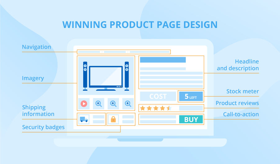
Product headline and description. Being the most visible part of your page in the search engines, a headline must be catchy and concise. Similarly, the product description should grab the visitor’s attention. Enhance it with selling product details and don’t forget high-search keywords for bigger search traffic. Take the features, advantages, and benefits (FAB) approach to describe a product and define clearly its value proposition.
Imagery. Visual communication is just as important as the text, for it gives visitors a good idea of the product’s look. Add a pinch of inspiration and showcase your products most attractively: with high-resolution and even AR-powered images, depicted in the real environment or filmed in use.
Call-to-action. You may have several call-to-action buttons offering a visitor to add a product to the cart or the wish list, save for later or buy in one click. Make them prominent on the page by contrasting their color with the page background.
Navigation. Show the complete route the customer took to arrive on the page by using breadcrumb navigation.
Stock meter. The stock meter indicates the availability of the product. If a limited amount of product is left, indicate that to create a sense of urgency and give the visitor another reason to act quickly. You can also convert out-of-stock and soon-in-stock items by offering a pre-order possibility.
Product reviews. Give your clients the opportunity to leave product reviews. It will be the social proof of your products’ quality, which is a strong incentive to buy for many people.
Shipping information. In my practice with ecommerce companies, I have noticed that companies showing the delivery terms (cost and time) as late as at the checkout, often have higher shopping cart abandonment rates. The best practice is to include this information on the product page because visitors need it when making a purchasing decision.
Security badges. A security badge indicates the presence of security measures and impacts customer trust positively. By the way, we at ScienceSoft also have a practice of issuing security badges after security testing to confirm the customers’ high protection level.
A product page example to follow
Product pages in the Grizzly Industrial web store contain many of the elements of good design mentioned above.
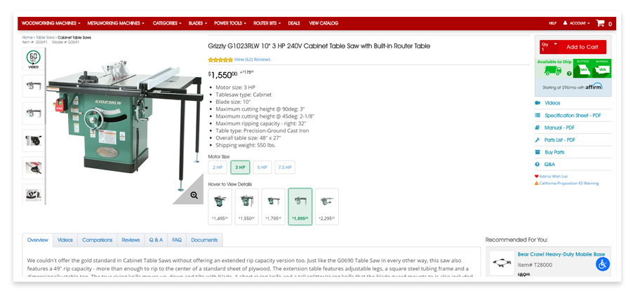
Right off the first glance, you see a concise listing of product features while detailed product specifications are collected on the right. It is valuable given the complex nature of the product. The navigation tabs at the bottom of the picture lead to a series of how-to videos, frequently asked questions and product reviews. With that, the seller gives the most comprehensive product information and provides for a truly informed purchase decision. The call-to-action button contrasts with the rest of the page, and the search box below the button allows users to check for shipping availability quickly.
It’s time to improve your clients’ shopping experience
With stiff competition in most ecommerce product lines, managing the experience a potential customer has with your website and products is important. The best practices mentioned above will help you convert visitors on product pages better. And if you feel like improving the user experience throughout your website, we can help you with this goal too. Don’t hesitate to contact us with a website redesign request!
