 ScienceSoft Global
 Healthcare
 Finance
Why Your Web Project Needs a Mobile-first Design Approach

Related topics:
5 min read
Last updated:
Editor’s note: In the article, Anastasia tells why the mobile-first design strategy guarantees impressive results in catering to mobile users’ needs and how it powers up responsive design. If you consider applying the mobile-first approach in you project, feel free to turn to ScienceSoft’s web design services.
According to the latest global stats, 52.6% of all internet traffic originates from mobile, while some of ScienceSoft’s clients report that the share of their mobile visitors surpasses 55%. In other words, if you already have or plan to get a website, a web portal or a web app, mind that more than half of your visitors are or will be viewing it on a mobile device.
In this article, I’m going to explain why desktop-first designs don’t work for mobile and the mobile-first strategy is catching on, and why you should look for a vendor, who knows how to properly combine this strategy with the responsive design technique.
Why the desktop-first approach ruins the mobile experience
When mobile devices are not accounted for at the very start of the design process, the software ends up being ‘squeezed’ into a mobile screen. This often means that some of the software’s essential features from the desktop version are lost on mobile simply because they didn’t fit.
In its UI audit practice, ScienceSoft uncovered even more dangerous issues with desktop-first design that resulted in instant visitor bounce. One of such issues is related to the hover action, which simply doesn’t exist on touchscreens. If your desktop website isn’t adapted for mobile and its menu relies on cursor hovering, you’ll deprive mobile visitors of the possibility to navigate web pages, and they’ll leave.
To put it short, the interaction with web content on a desktop device is extremely different from interaction on mobile. So, if you want to make sure that both your desktop and mobile visitors feel comfortable enough to stay, register, and pay, you need to cater to their device-specific needs.
How mobile-first design helps create a quality mobile experience
Making your web solution look and feel natural across devices takes a lot of meticulous work. The mobile-first strategy is what helps organize this work and get tangible results.
The key rationale behind the mobile-first design strategy is that limited space and specific interaction patterns make designing content for mobile a lot more difficult than for desktop devices. Creating the mobile UI first allows designing quality mobile experience without being limited by the constraints of finished desktop design.
In my view, the biggest advantage of the mobile-first strategy is that it helps avoid ‘graceful degradation’ – stripping a full-screen UI of its elements in order to fit it in the mobile screen. Instead, the approach supports ‘progressive enhancement’ – the strategy of introducing the essential features for mobile devices and adding more nuanced layers of functionality and content on larger screens.
How you benefit from combining the mobile-first strategy with responsive design
Although I see such statements as ‘mobile-first is better than responsive design’ get quite common, they don’t make much sense. Mobile-first design is about strategic planning, while responsive design is a design technique. So, instead of choosing between a tool and a material, make sure your vendor combines the two.
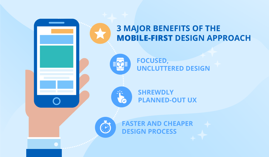
In ScienceSoft’s practice, we’ve uncovered three major benefits of the mobile-first approach for responsive design:
Focused, uncluttered design
The first step is to analyze the users’ needs and prioritize the elements of the future web solution based on the collected data. Early prioritization allows creating neat, uncluttered design on all devices. Thus, while designing the mobile version for the smallest screen, we include only top-priority content and add elements with a lower priority on larger UIs that offer more free space for elements.
This way, the mobile UI answers the essential needs of the users instead of simply having those desktop elements that managed to fit on the screen.
Shrewdly planned-out UX
Designing for mobile first makes us consider all the mobile UX nuances at the very start of the project. This eliminates situations where mobile-incompatible content elements or interaction patterns – for instance, small and not tap-friendly click areas – are already included in a desktop-sized layout and need additional time and money to be readjusted or reworked in a mobile version.
Faster and cheaper design process
Mobile UI is created for weaker browsers that usually cause more bugs and errors in displaying responsive content. Getting these errors out of the way at the early stages makes further development smoother, whereas desktop-first design would only uncover such bugs at the end and force the development team to readjust code for all the larger screen versions too.
Choose the right starting point for your web project
Only when counted in from the start, mobile design can be done right. By ensuring the mobile-first design strategy for your web project, you get the confidence in its results while fitting in your budget and time frame. If you want ScienceSoft to help you apply this approach in practice, feel free to reach out to us.
