Payment Page Design – How Improved UI Encourages Your Clients to Purchase

Editor’s note: Find out which payment page design elements improve customers’ checkout experience and increase conversions. To adopt them for your online store, check ScienceSoft’s ecommerce website design services.
If you have a running online store, you know that you can’t always interpret high traffic as high sales. But the rule doesn’t apply to checkout traffic. High checkout traffic should mean high conversion rates. And if it doesn’t, something is wrong with your payment page design. The truth is, you can have an appealing and smoothly running website and an effective payment gateway for quick payment processing, but an inconvenient payment page will bring your efforts to nothing.
Below I share some easy design tips that will entice your clients to complete their shopping journeys with a buy.
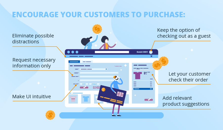
Request necessary information only
You should get rid of the fields that are not needed for successful order completion. For example, you can make the checkout flow faster by omitting the billing address field or assuming that it is the same as the shipping address by default. If your business offers digital products, which you don’t need to ship, you won’t need a customer’s shipping address. In this case, you can cut both the Shipping Information and Billing Information fields from the template of your payment page.
Keep the option of checking out as a guest
28% of customers say they abandon shopping if a store asks them to create an account to continue. So, my advice is to leave the options open to your clients. Having done so, you can still encourage registration by pointing out the benefits customers will get with it. For example, you can provide the possibility to quickly repeat orders without entering payment details anew or offer a discount on the first purchase after registration.
Make UI intuitive
Good checkout experience comes with little things that make the whole user interface more customer-friendly. Those elements include clear format indicators for input fields and input masks (e.g., MM/YY in a card expiry date field), spaces between number groups in a card number field, and immediate input validation.
Let your clients check their order
Customers may want to make sure they didn’t forget to add anything, and they need to see the total amount they are going to pay. The Order Summary section allows them to review the products in their shopping cart and to see the order total broken down into subtotal, delivery costs, taxes, and possible discounts applied.
Eliminate possible distractions
Payment page design should match the design of your online store when it comes to a color scheme or font style. However, it is a good practice not to include the elements that will distract a customer and make them leave the page, even back to your store. Such elements interrupting the checkout process include the navigation menu of your online store, a search field, and banners with promotions. An ideal template would be a separate page with a plain background that has only input fields and an order summary.
Add relevant product suggestions
You can show products relevant to the ones in a customer’s shopping cart to increase average order value or offer free samples complementary to a purchase made. In both cases, be careful not to add too much as it can damage the whole checkout experience.
Guide your clients through a clear checkout page
Good payment page design aims at making the checkout process so effortless that it would be almost invisible. In this article, I have outlined the elements of UI that improve the checkout experience and bring you more completed sales.
However, the abundance of details to take into account might be confusing and make you lose the big picture when designing a checkout page. If you need assistance with designing a payment page with high conventions in mind or increasing the converting power of your existing payment page, let us know.
