Big Data Visualization: Value It Brings and Techniques It Requires

Providing big data services since 2013, we can say with confidence that dashboard design seems to be the most underestimated by those who implement the technology. Unfortunately, not all companies share the thinking of Rolls-Royce that believes visualizing big data is as important as manipulating it. Most often, companies don’t realize how much these fancy graphs and charts contribute to making informed decisions until they have to find some valuable insights within seconds among the billions of data records.
Over the past decade, this number has been growing at impressive rates. According to a survey by Matillion and IDG, the amount of data at enterprises grows by 63% each year, while for 12% of the surveyed organizations, the reported increase is as high as 100%. The number of data sources complicates things even more: on average, enterprises deal with data from about 400 sources.
At the same time, businesses just can’t afford to miss the opportunities that their data brings. According to a Statista report on the state of big data and AI adoption in organizations, 75% of businesses worldwide use data to drive innovation, and 50% report that data helps them to compete in the market.
Big Data Visualization Makes a Difference
John Tukey, a celebrated mathematician and researcher, once said: “The greatest value of a picture is when it forces us to notice what we never expected to see.” And our data visualization team couldn’t agree more. Visualization allows business users to look beyond individual data records and easily identify dependencies and correlations hidden inside large data sets. In fact, a global survey by BARC and Eckerson Group reveals that for 13% of organizations, a lack of reports and visuals hinders BI adoption.
Here go examples of how big data analysis results can look with and without well-implemented data visualization.
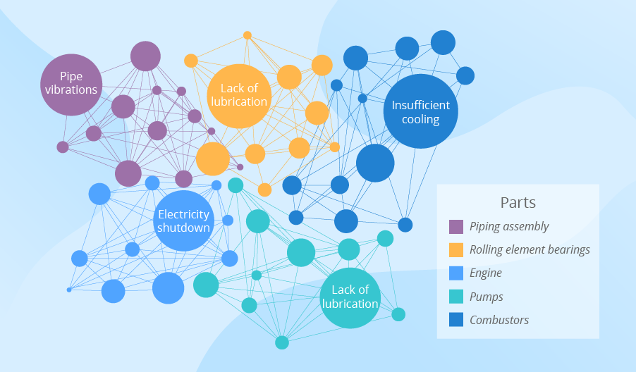
Example 1: Analysis of industrial data
In some cases, the maintenance team can skip the ‘looking for insights’ part and just get notified by the analytical system that part 23 at machine 245 is likely to break down.
Nevertheless, the maintenance team is unlikely to be satisfied with instant alerts only. They should be proactive, not just reactive in their work, and for that, they need to know dependencies and trends. Big data visualization helps them get the required insights. For example, if the maintenance team would like to understand the connections between machinery failures and certain events that trigger them, they should look at connectivity charts for insights, just like in the example of visualizing big data that you can see below.
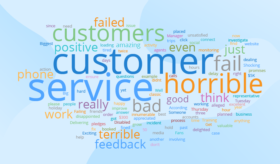
Example 2: Analysis of social comments
Imagine a retailer operating nationwide. One customer may visit their store and post on Facebook: “Guys, if you haven’t bought Christmas presents yet, go to [the retailer’s name].” Another customer may share on Twitter: “I hate New Year time! I’ve never seen lines that long! I wasted an hour at [the retailer’s name] today. And the staff was rude. Hate this place!” The third customer may post on Instagram: “Look what a gorgeous reindeer sweater I bought at [the retailer’s name]!”
The company’s customer base is 20+ million. It would be impossible for the retailer to browse all over the internet in the search of all the comments and reviews and try to get insights just by scrolling through and reading all the comments. To have these tasks automated, companies resort to sentiment analysis. And to get instant insights into the analysis results, they apply big data visualization. For example, word clouds demonstrate the frequency of the words used. The higher the frequency, the bigger a word’s font. So, if the biggest words are hate, awful, terrible, failed, and their likes – it’s high time to react.
Example 3: Analysis of customer behavior
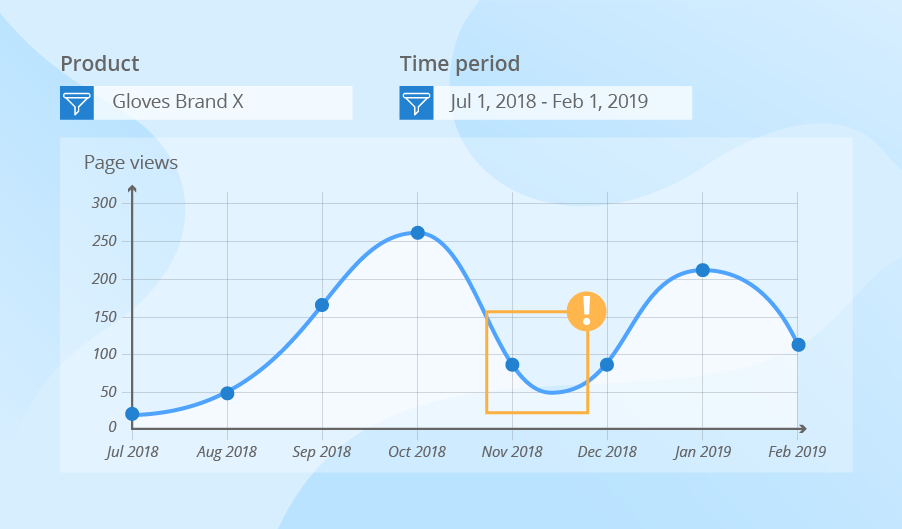
Companies use a similar scenario to analyze customer behavior. They strive to implement big data solutions that would allow gathering detailed data about the purchases in brick-and-mortar and online stores, browsing history and engagement, GPS data and data from the customer mobile app, calls to the support center and more. Registering billions of events daily, a company is unable to identify the trends in customer behavior if they have just multiple records at their disposal. With big data visualization, ecommerce retailers, for instance, can easily notice the change in demand for a particular product based on the page views. They can also understand the peak times when visitors make most of their purchases, as well as look at the share of coupon redemption, etc.
Most Frequently Used Big Data Visualization Techniques
Earlier, we studied big data visualization examples and how companies can benefit from big data visualization, and now we’ll give an overview of the most widely used data visualization techniques.
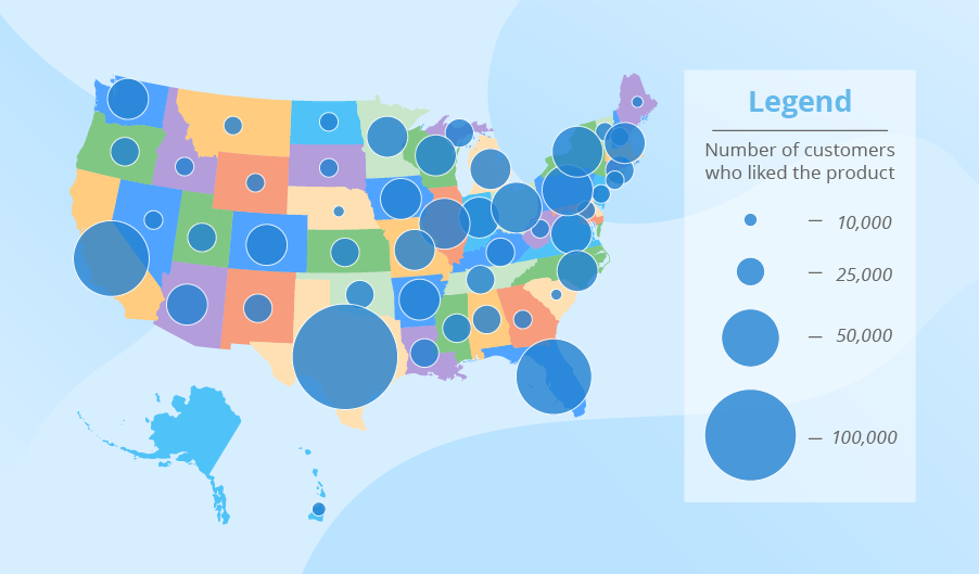
Symbol maps
The symbols on such maps differ in size, which makes them easy to compare. Imagine a US manufacturer who has launched a new brand recently. The manufacturer is interested to know which regions liked the brand particularly. To achieve this, they can use a map with symbols representing the number of customers who liked the product (left a positive comment in social media, rated a new product high in a customer survey, etc.)
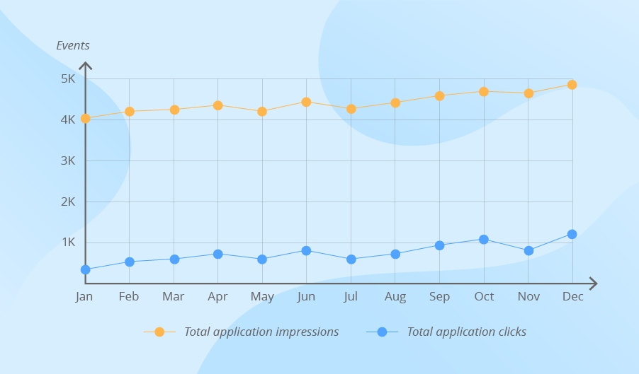
Line charts
Line charts allow looking at the behavior of one or several variables over time and identifying the trends. In traditional BI, line charts can show sales, profit and revenue development for the last 12 months. When working with big data, companies can use this visualization technique to track total application clicks by weeks, the average number of complaints to the call center by months, etc.
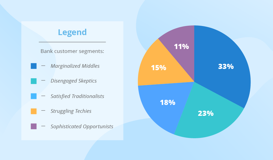
Pie charts
Pie charts show the components of the whole. Companies that work with both traditional and big data may use this technique to look at customer segments or market shares. The difference lies in the sources from which these companies take raw data for the analysis.
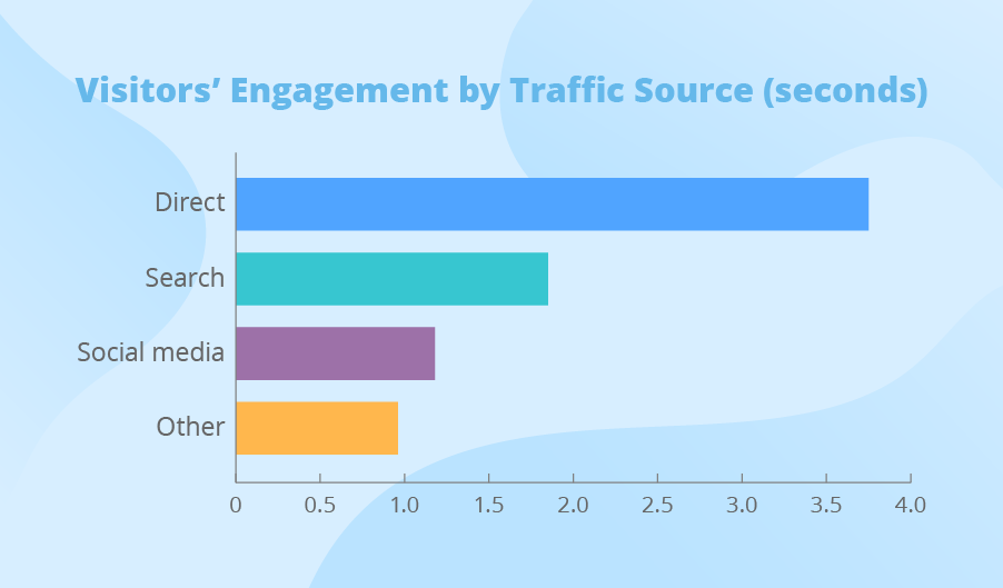
Bar charts
Bar charts allow comparing the values of different variables. In traditional BI, companies can analyze their sales by category, the costs of marketing promotions by channels, etc. When analyzing big data, companies can look at the visitors’ engagement with their website’s multiple pages, the most frequent pre-failure cases on the shop floor and more.
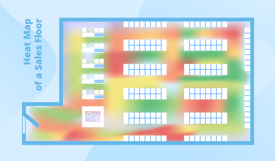
Heat maps
Heat maps use colors to represent data. A user may encounter a heat map in Excel that highlights sales in the best performing store with green and in the worst performing – with red. If a retailer is interested to know the most frequently visited aisles in the store, they will also use a heat map of their sales floor. In this case, the retailer will analyze big data, such as the data from a video surveillance system.
Best Practices for Big Data Visualization
Focus on dashboard performance
Preprocess big da before it hits the dashboard, e.g., use ETL/ELT pipelines, partition large database tables, or store frequent aggregations in the data warehouse. For the same purpose, it’s important to avoid placing multiple high-granularity visuals on the same page (e.g., detailed scatter plots, heatmaps).
Use progressive disclosure
Make sure you don’t overwhelm the user. Show high-level metrics first and let users drill down and open more views if they need them.
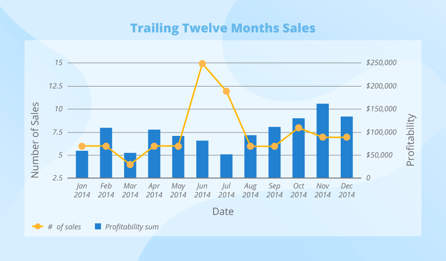
Use comparable measures within one visual
For example, in a bar chart, it makes sense to compare numbers with percentages. However, comparing profitability with the number of sales won’t be that informative. In such a case, it is possible to combine two visual types. For instance, to track the dynamics of sales-generated revenue, we can take a bar chart that represents the number of sales and layer it over a line chart that reflects monetary revenue.
Avoid using visuals that represent just totals
Big data datasets often hide variance and anomalies, and it’s best to use visuals that reflect statistical distribution, volume, and density, e.g., box plots, histograms, scatter plots. For example, a bar chart that shows total salaries per department won’t show how salaries are distributed within each department or if there are any outliers, while a box plot could reveal it. Similarly, a histogram would illustrate salary distribution across employees, and a scatter plot could help benchmark salaries against years of experience.
Comparison of Popular Data Visualization and Analytics Tools
Now that we’ve reviewed the main data visualization types, let’s see what tools can help with the task. Below, our data visualization team has outlined the comparison of BI and visualization tools that we frequently use in our projects. While each product has its pros and cons, they share a lot of common capabilities. For example, all tools support the creation of various types of visuals and interactive dashboards, connectors for integration with multiple databases and services, and data storytelling.
| Parameter | Microsoft Power BI | Tableau | QlikView | Looker |
| Capabilities for big data handling | Best for small to medium datasets. | Best for complex dashboards and visuals. | Best for vast datasets. | Best for cloud-native big data environment. |
| Real-time data support | Combines streaming datasets and DirectQuery. |
Features live connectors. |
Has limitations, better at cached speed. |
Should be supported by the warehouse (e.g., BigQuery). |
| Cloud dependency | Highly dependent on and tightly integrated with Microsoft Azure (e.g., Azure is the only deployment option). | Part of the Google Cloud Platform (GCP) ecosystem, but it is not technically dependent on GCP due to a cloud-agnostic architecture. | Offered as a service across all major clouds, incl. Azure, AWS, GCP, and Alibaba Cloud. | Deeply integrated with Google Cloud services but allows for deployment on AWS and Azure using infrastructure-as-code tools like Terraform. |
| Visualization performance | Fast on filtered data but slower on DirectQuery. | Fast response with extracts, has an excellent user-friendly UI. | Fast on in-memory, has less modern UI in comparison to other tools. | Very fast for summary-level dashboards. |
| Industry-specific focus | Offers multiple pre-built templates and BI solutions for multiple industries, incl. healthcare, finance, retail, and manufacturing. | Doesn’t offer field-specific templates but demonstrates high flexibility in customizing dashboards to the unique industry needs. | Lacks industry-specific solutions but relies on partners to create them. | Doesn’t offer field-specific templates but demonstrates high flexibility in customizing dashboards to the unique industry needs. |
| No-code usability | Very strong, with drag-and-drop interfaces. | Very strong, with drag-and-drop interfaces. | Focused on developers, requires some scripting knowledge for dashboard creation but has Qlik Sense, a version that is more friendly towards non-technical users. | Focused on developers, relies on coding-based modeling language. |
| AI copilot | Supports natural language querying and AI-powered insights (Microsoft Copilot). |
Supports natural language querying and AI-powered insights (Explain Data and Ask Data). |
Available in Qlik Sense. |
|
| Costs | $10–$24 per user per month, depending on the subscription plan. Pricing details | $35–$115 per user per month, depending on the subscription plan.(See how we optimized them for a client to save 15%). Pricing details | $200–$2,750, depending on the subscription plan that can cover a different number of users. Pricing details | Pricing is available upon request and includes cloud resource and user licensing costs. |
Importance of Interactive Elements in Data Visualization
Back in 2012, John Brand, a VP and CIO Exec Partner at Forrester, described interactive visuals as an imperative rather than a luxury: “Users now expect that they can completely interact with data, not just visualize it. Static reports simply don't cut it anymore. This means that the visualization tools must understand the context of the data and be able to dynamically adapt the navigation, look and feel and even the core functionality as user manipulate and immerse themselves in the information.”
The recent situation confirms the relevance of his words, with interactive data visualizations being the most popular visualization type in the market. Gartner even listed interactive techniques as one of the mandatory features for BI and analytics tools to be included in the respective Magic Quadrant report.
Such visualizations improve user engagement and facilitate data exploration. For example, users can apply filters to reflect only the needed subsets and easily switch between data views and click on elements to drill down to more granular data.
Beyond Interactive: What Other Data Visualization Techniques Are Out There?
Interactive visuals are just one of the ways to enhance data visualization practices. With recent technology advancements, big data visualization can be even more impactful and easier to use. Here are a few examples:
AI-powered visual generation
BI solutions can have natural language interfaces that allow users to type or dictate commands, describing the visual they want to get. The same functionality can be used to adjust the freshly generated output or already existing visuals. You can see ScienceSoft’s demo of a Power BI chatbot to learn how AI-powered data visualization works in practice.
Real-time data visualization
The dashboards that reflect data updates as soon as they arrive are attractive but you’ll need an underlying real-time big data processing infrastructure to enable them. Such factors as performance, optimization, and latency are key, otherwise no dashboard would be able to support incoming data efficiently.
VR and AR
Both technologies ensure an immersive experience. For example, it’s possible to project financial data onto physical spaces.
Visualize Your Big Data The Right Way
If you need assistance in choosing the right tools and techniques for visualizing your big data, you can go for big data consulting and share the journey with experts.
