

Mobile has never been such an important focus for ecommerce as it is now. With the share of mobile website traffic reaching more than 52% of all website traffic in 2018, improving customers’ mobile experience becomes crucial for ecommerce businesses. However, there is still a long way to go before they can offer perfect mobile experience for online shoppers.
Here are 4 reasons why mobile users may detest your ecommerce site’s user interface, as well as the overall user experience, and how you can address these issues.
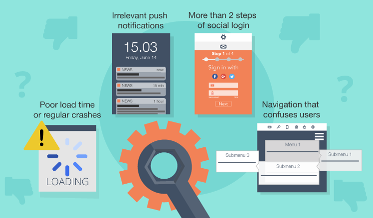
1. Poor load time or regular crashes
The first bummer for an ecommerce site is slow loading. Studies have shown that 1-2 seconds is acceptable page load time. If your site takes longer to load, about 44% of your customers will share bad feedback with their friends. It’s that serious.
Making your website load quickly is half the battle. Make sure that it also does not crash. Running a site that crashes every now and then, you will surely get flooded with all the hate.
A server that can support your site’s needs is critical for good performance. It would also help if you keep your site light and remove unnecessary objects such as heavy videos and large images.
2. Irrelevant push notifications
Sending mobile push notifications is a common practice, and when done right, it turns into a smart marketing strategy. However, to benefit from it, you should give customers a choice to subscribe or unsubscribe from push notifications. So that you don’t annoy users who have signed up, make sure that you keep it between 2 to 5 times a week. And never neglect relevance. Don’t push just a generic material to everyone. Personalize it based on your users’ activity on your site. That way, you can make the most out of your push notifications.

A comment from Justin @jschool888 about a push notification of The Wall Street Journal app
3. More than 2 steps of social login
Social login is common for a lot of sites, including ecommerce ones. But sellers need to mind the number of steps not to waste customers’ time. As a rule, two-step login is an excellent solution. Your site should never ask customers to create a username and password if they select a social login option – that’s just counterintuitive.
4. Navigation that confuses users
Your site’s quality of navigation is largely based on your user interface and has a huge impact on user experience. You should consider navigation while making mobile website design not to end up confusing users.
One of the ways how you can fail is by using unconventional icons that are not straightforward. Of course, you can base icons on your brand design but make sure that you follow standard rules, such as a left arrow means back and a house icon means returning to the home page of your site.
Also, making too many levels of menus and sub-menus considerably hampers finding the needed page. When you design your site’s navigation scheme, make sure to keep it simple and intuitive. You are supposed to make it easy for your users to go through your site, not harder.
Make sure that your menus have just enough levels, work well and stay on the screen long enough for customers to move the cursor to the next level.
Make your site earn the likes it deserves
Setting up an ecommerce site and making it work across different devices is not an easy task. However, if you fail to make it appealing to your users, it might lose the likes it deserves. We hope that the four mistakes we have described above will help you make your site worth visiting.

Our consultants will help to shape an optimal ecommerce solution for your business.


